When it comes to product packaging, 2018 has brought us lots of innovations and fresh new options to experiment with, both aesthetically and functionally. And 2019 will pick up right where 2018 left off. Get ready to see designers play with color, graphics and materials in exciting new ways. Here I’ve compiled a list of the most influential trends in packaging design we’ll see in 2019.
>> Check out our 2020 packaging design trends here
As designers, in order to evolve alongside changing styles and trends, we must take some time to analyse the tendencies that impact our trade the most. Only if we reflect on the evolution of design we’re seeing all around us, we can anticipate the trends to come and work on shaping the future in new and inspiring ways.
9 big trends in packaging design for 2019
—
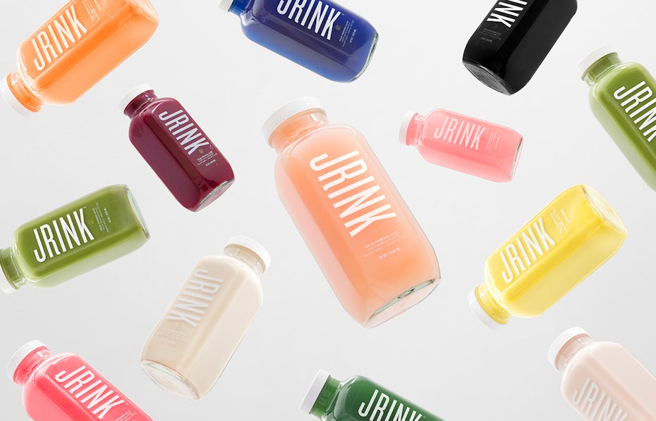
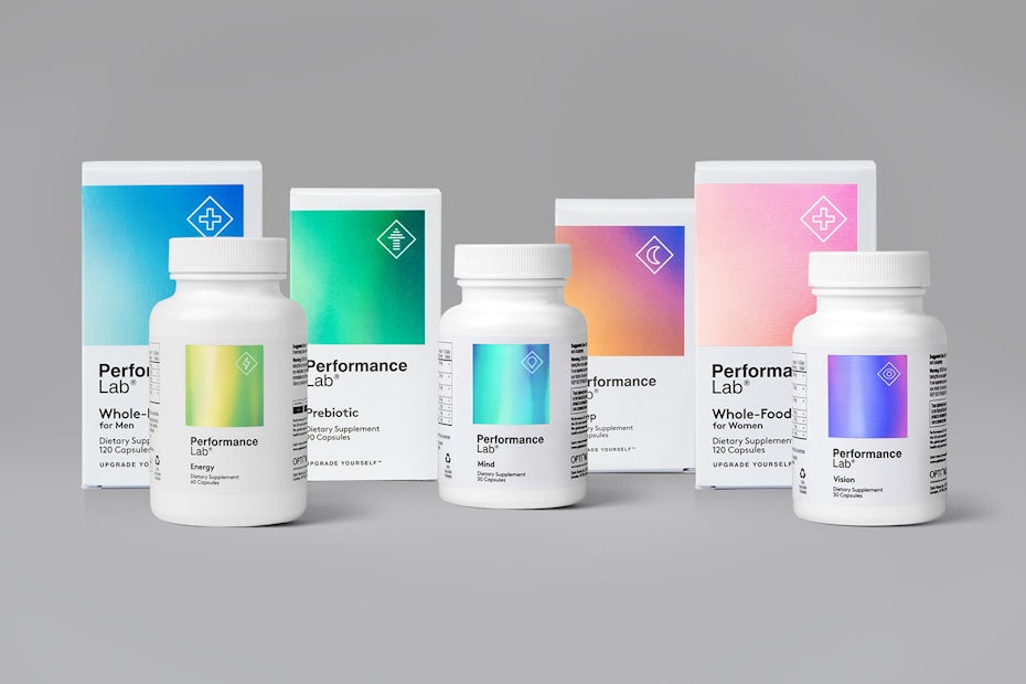
1. Minimalism that lets color shine
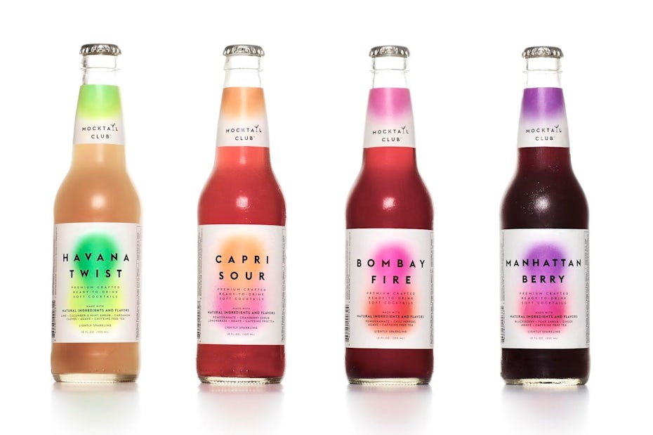
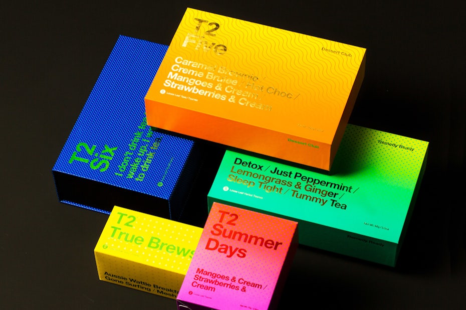
2. Bright gradients
3. Nude palettes
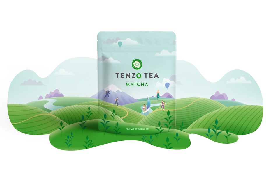
4. Flat illustration
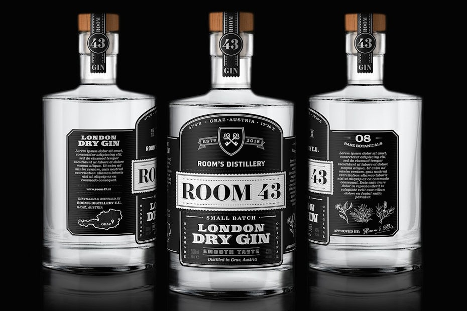
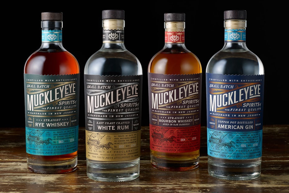
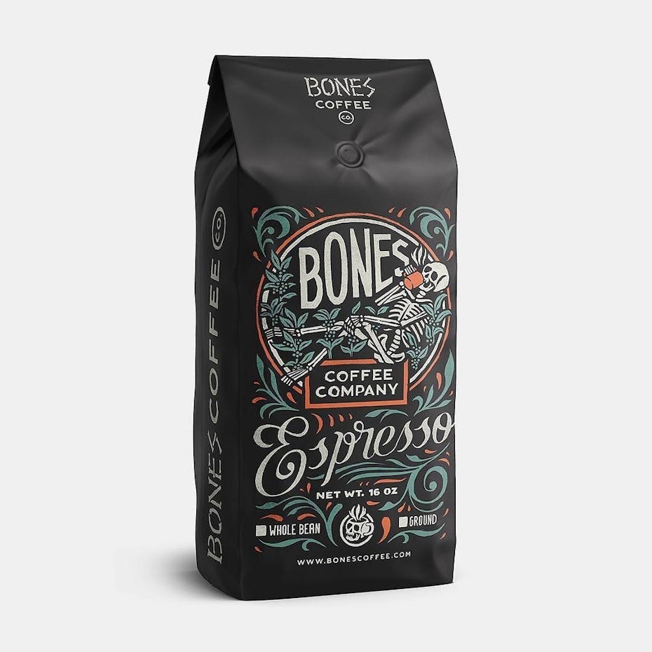
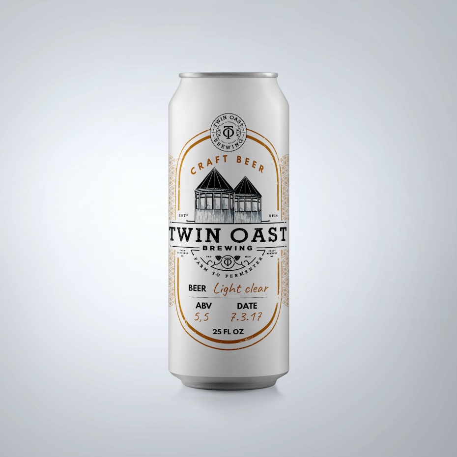
5. Vintage-inspired packaging
6. Black and white packaging
7. Atypical packaging design
8. 8-bit packaging design
9. Plastic free packaging
1. Minimalism that lets color shine
—
Minimalism doesn’t seem to go away and for good reason: more and more brands aim to be transparent and upfront. What better way to do that than through packaging design? With minimalistic packaging, everything non-essential is stripped away and the substance of the object is exposed—a core principle of minimalism that has found a welcoming home in packaging design and lets elements like color and typography really shine.
The act of cutting back to the core essence of something will always be challenging, but equally rewarding. It can turn out to be something that speaks to people from all walks of life through functionality, simple shapes and patterns, communicating their essential message. Even if less is more may have become a cliché, it’s still true as ever and the ideal of simplicity is hard to attain and master. Minimalistic packaging in 2019 will focus on clean and simple designs that let color and typography take center stage—which is incredibly impactful and guaranteed to stand out.
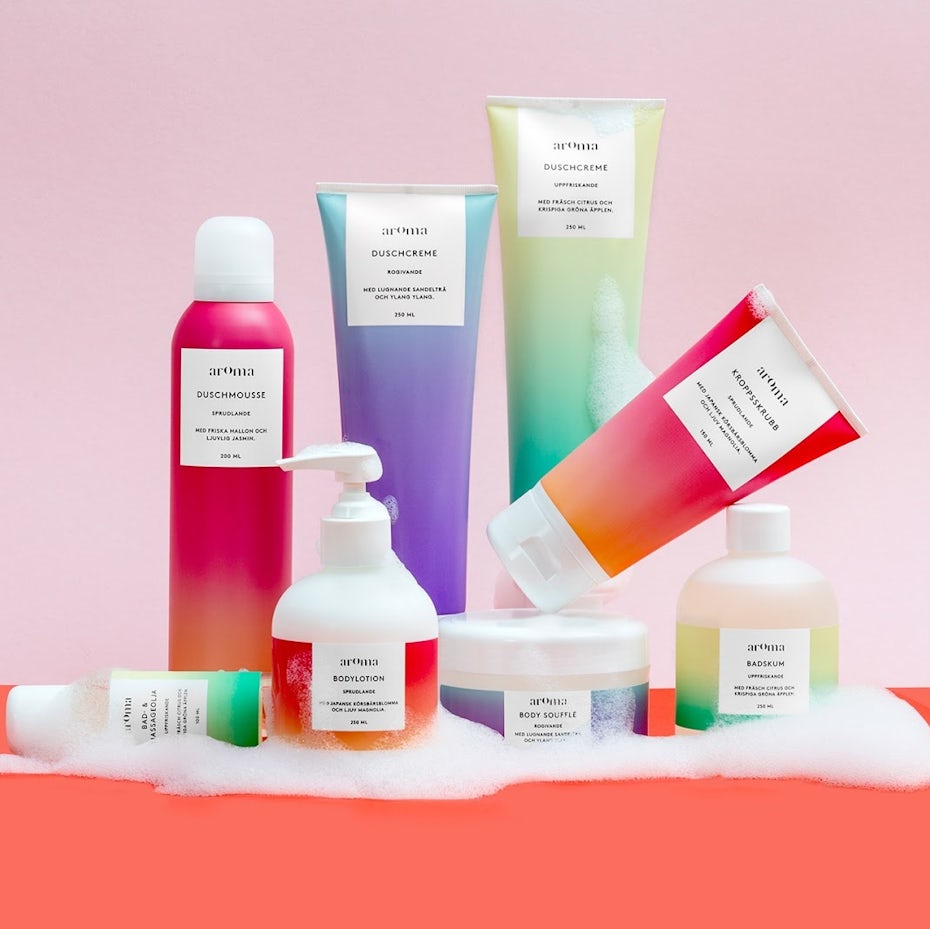
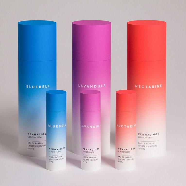
2. Bright gradients
—
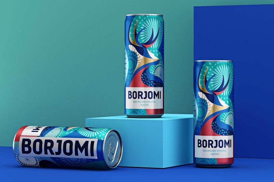
It is no surprise that gradients keep fascinating both designers and audiences. Gradients offer packaging designers the possibility to create something that feels fresh and new by blending colors, resulting in something unique and revitalizing. Just look at nature for some prime examples that will never get old.
Not only do gradients offer depth but they also look awesome in digital formats. It’s no wonder big companies like Microsoft or Apple started to embrace gradients as early as 2016. In 2019 gradients will be an essential element of design, bringing depth and dimension to any composition. And with bright and exciting color combinations they are working their way up from being mere background detail to becoming the main component of the design. Expect to see luminous, colorful and even neon gradients all over packaging design in 2019.
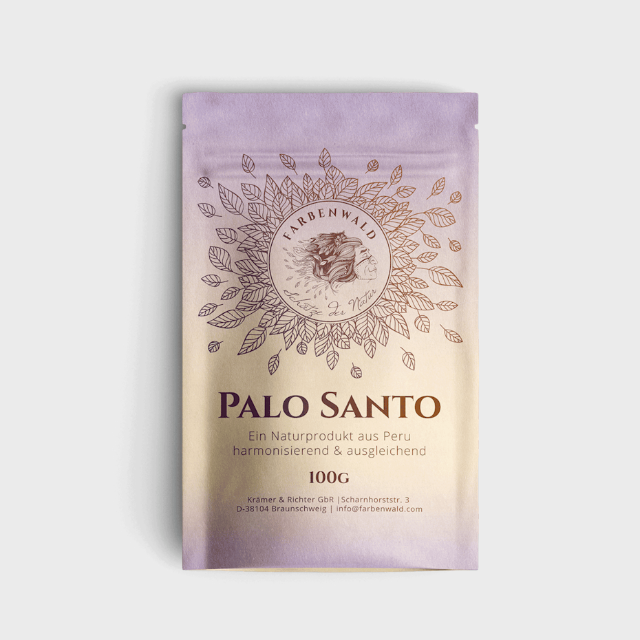
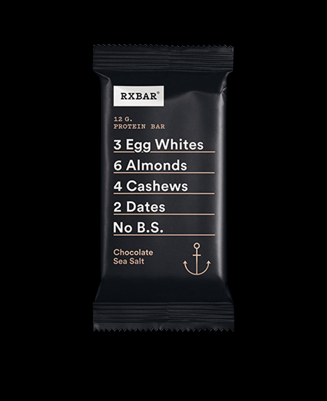
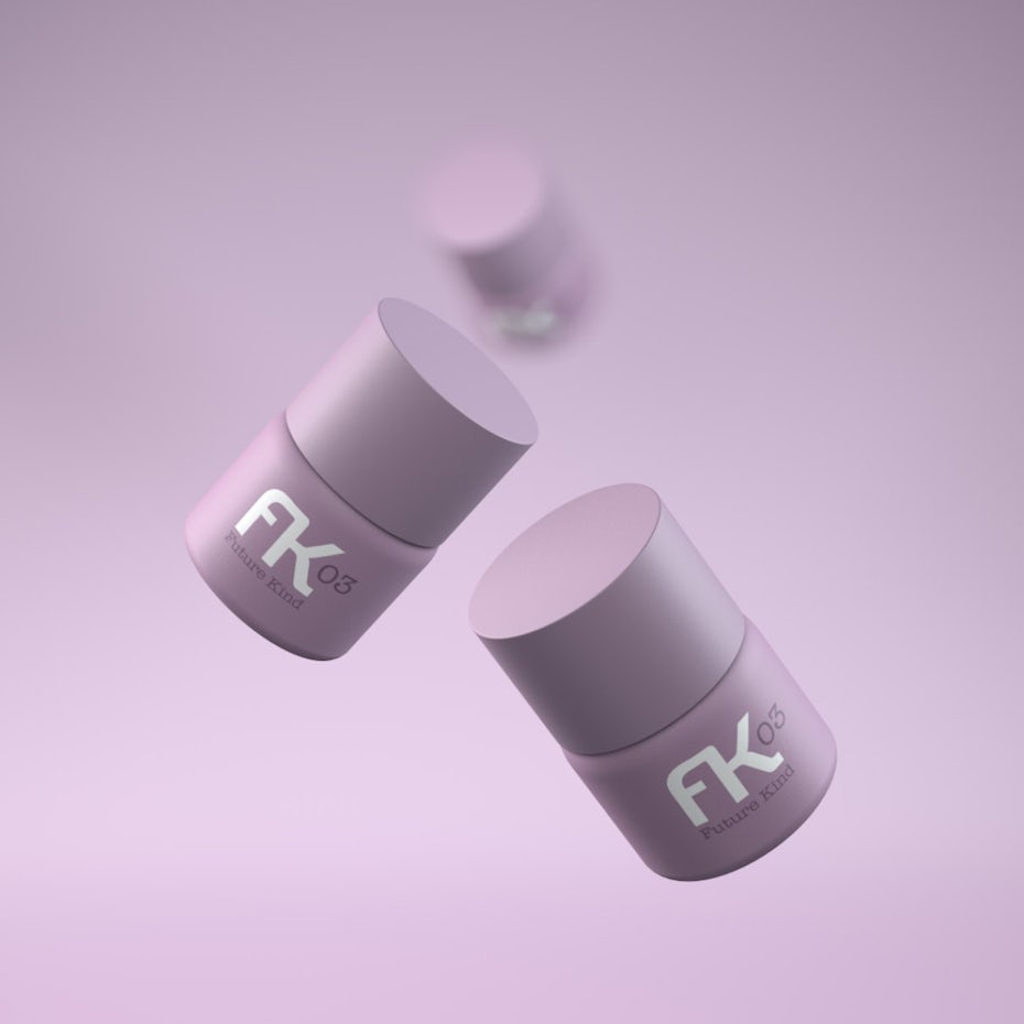
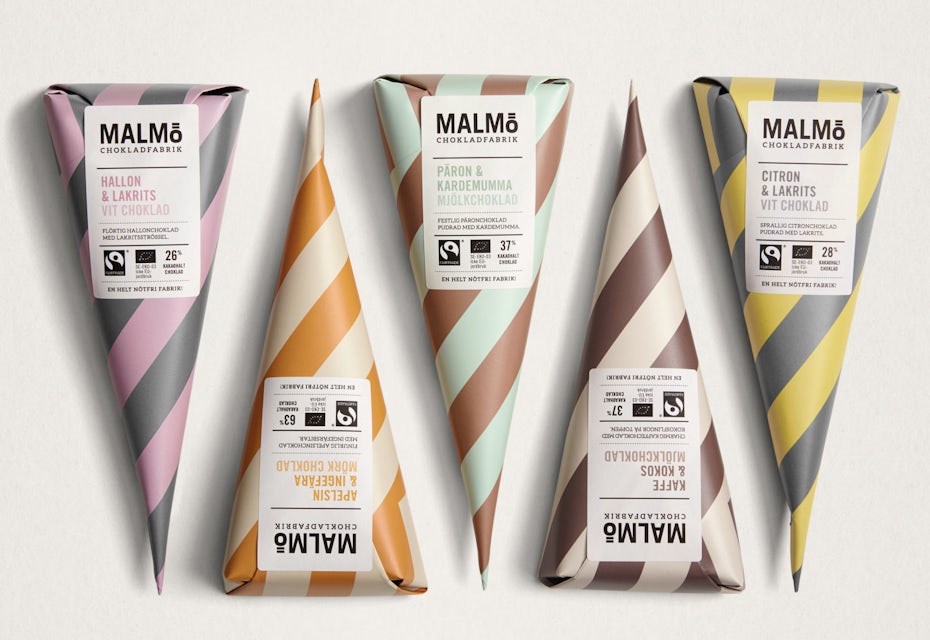
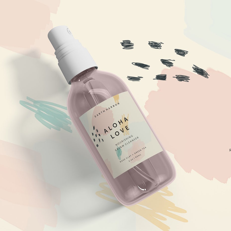
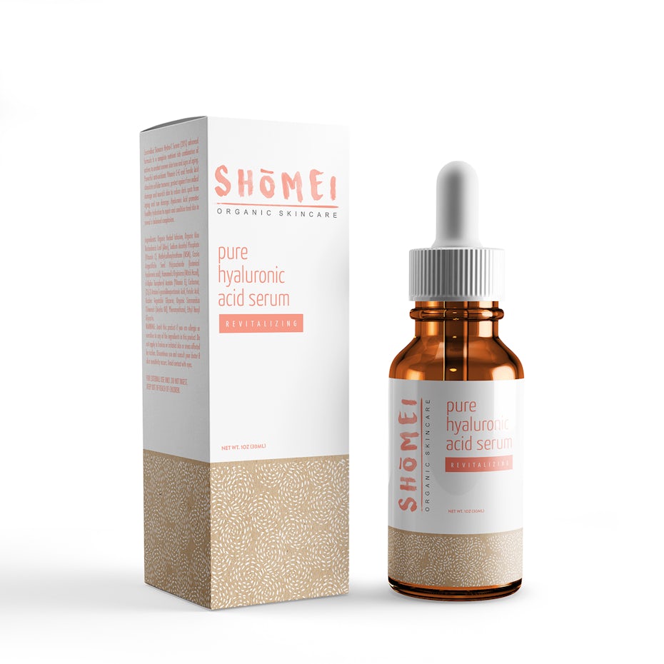
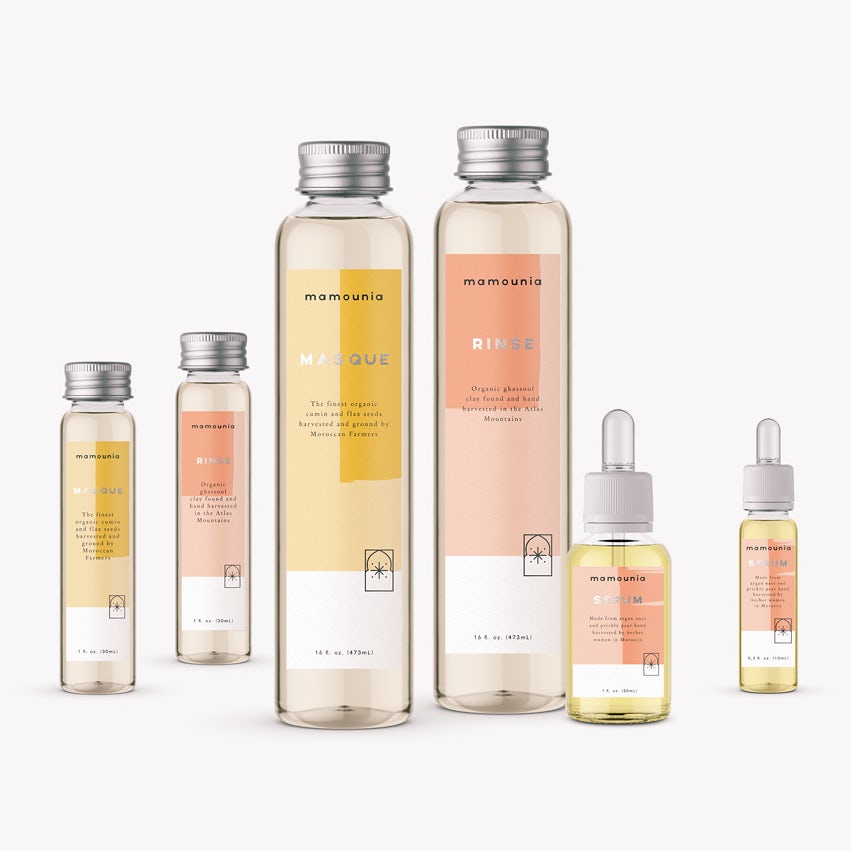
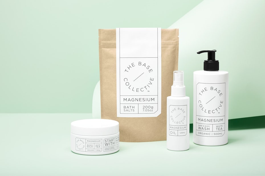
3. Nude palettes
—
Nude is not just one color, but a complex mixture of peach, rosy or ochre undertones, with cream or chocolate hues. Shifting towards an all-encompassing palette of nudes and neutrals has more and more appeal in various areas of design, packaging design above all. We’re seeing packaging designers embrace natural shades to ground their designs and play with combinations of nude, sepia and pastel palettes.
This trends is all about being soft and playful. 2019 brings an abundance of nude palettes including warm browns, creamy whites, pinks and beiges. They’re often combined with pops of candy colored pastels to make them stand out, as well as simple, clean white labels that don’t steal the spotlight from these unique color combinations and shapes.
4. Flat illustration
—
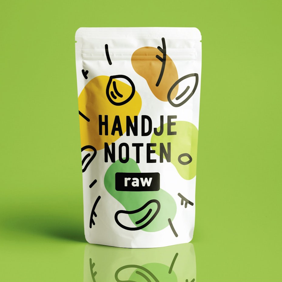
The roots of flat design go back to Swiss Style (or International Typographic Style) which appeared in the 1920s and bloomed into a significant foundation for graphic design in the mid 20th century. Given that the approach started from printed material, it is only logical that we see it thrive in packaging design. The focus that they have on simple design, color, typography and the overall minimalist approach they require, make flat illustrations ideal for almost any printed material.
Oftentimes we see flat illustration appear as simplified shapes that make blobs of color stand out, while text becomes more readable. These designs gain a crispness and clearness obtained by stripping away three dimensional effects. And the best thing about this trend is that it has enough flexibility to evolve freely. Designers can use parts of it and fuse them into almost any composition they like. The evolution of flat illustration in 2019 should bring us a step closer to a perfect harmony of functionality and aesthetics.

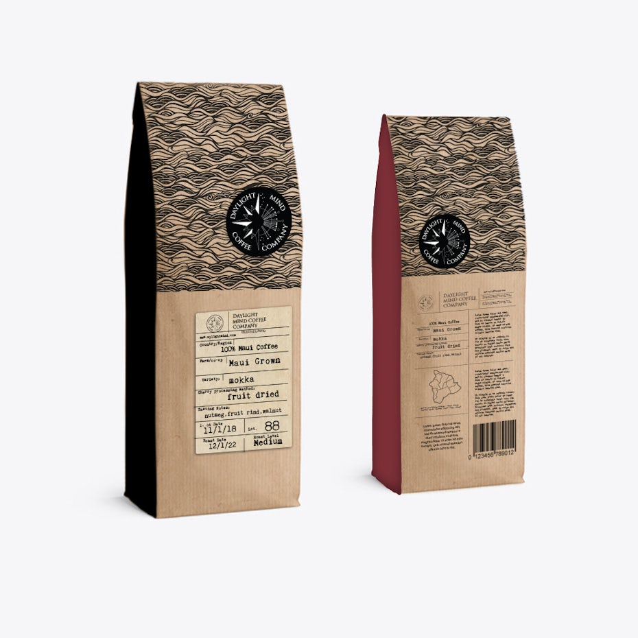
5. Vintage-inspired packaging
—
The retro aesthetic of packaging design is more popular than ever, especially for food and drink products. Wherever you are on the planet, vintage labeling or packaging are present in every store.
Vintage sells first of all because it conveys authenticity. And this is reflected in both the look but also the feel of the products. Besides the use of vintage-looking fonts, we are seeing more and more illustrations, manuscript lettering or retro color patterns being used to convey the feeling of age and pedigree.
In 2019, designers return to the old as the new “new” because they simply can’t bring themselves to add any more bling to packaging. In today’s market where new, improved packaging keeps coming out at a rapid pace, creating the most advanced packaging simply does not cut it anymore. Returning to the roots of packaging design is a timeless classic that will never lose its appeal.
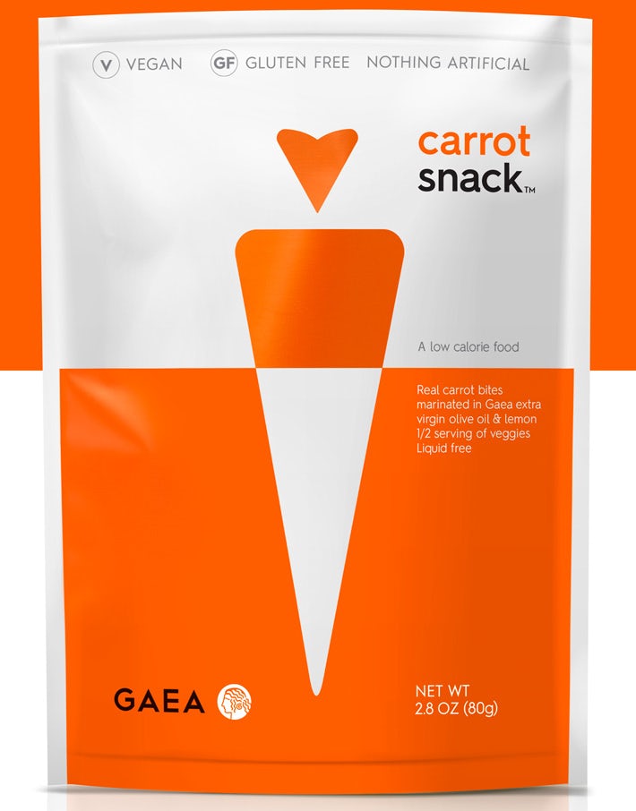
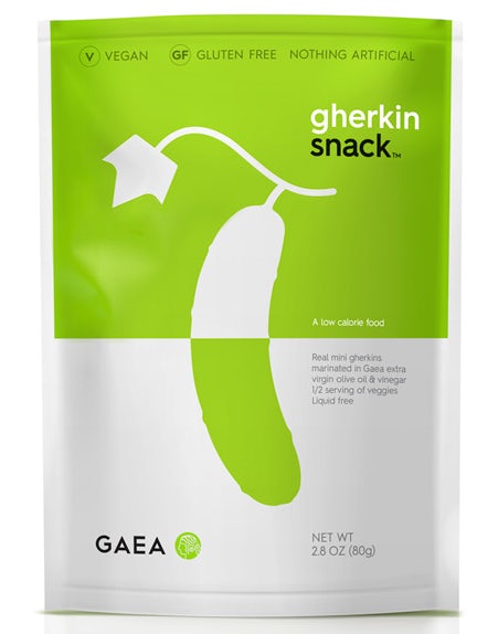
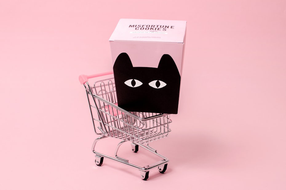
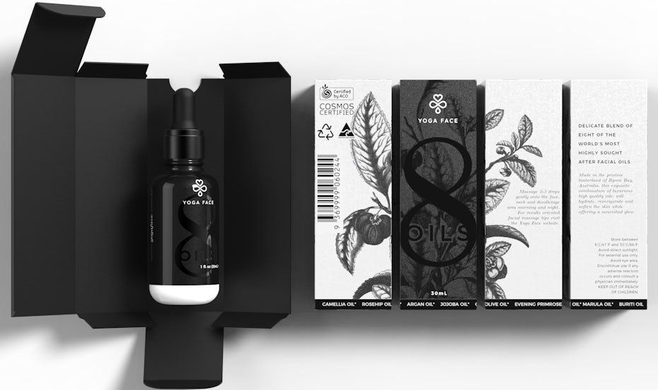
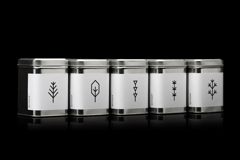
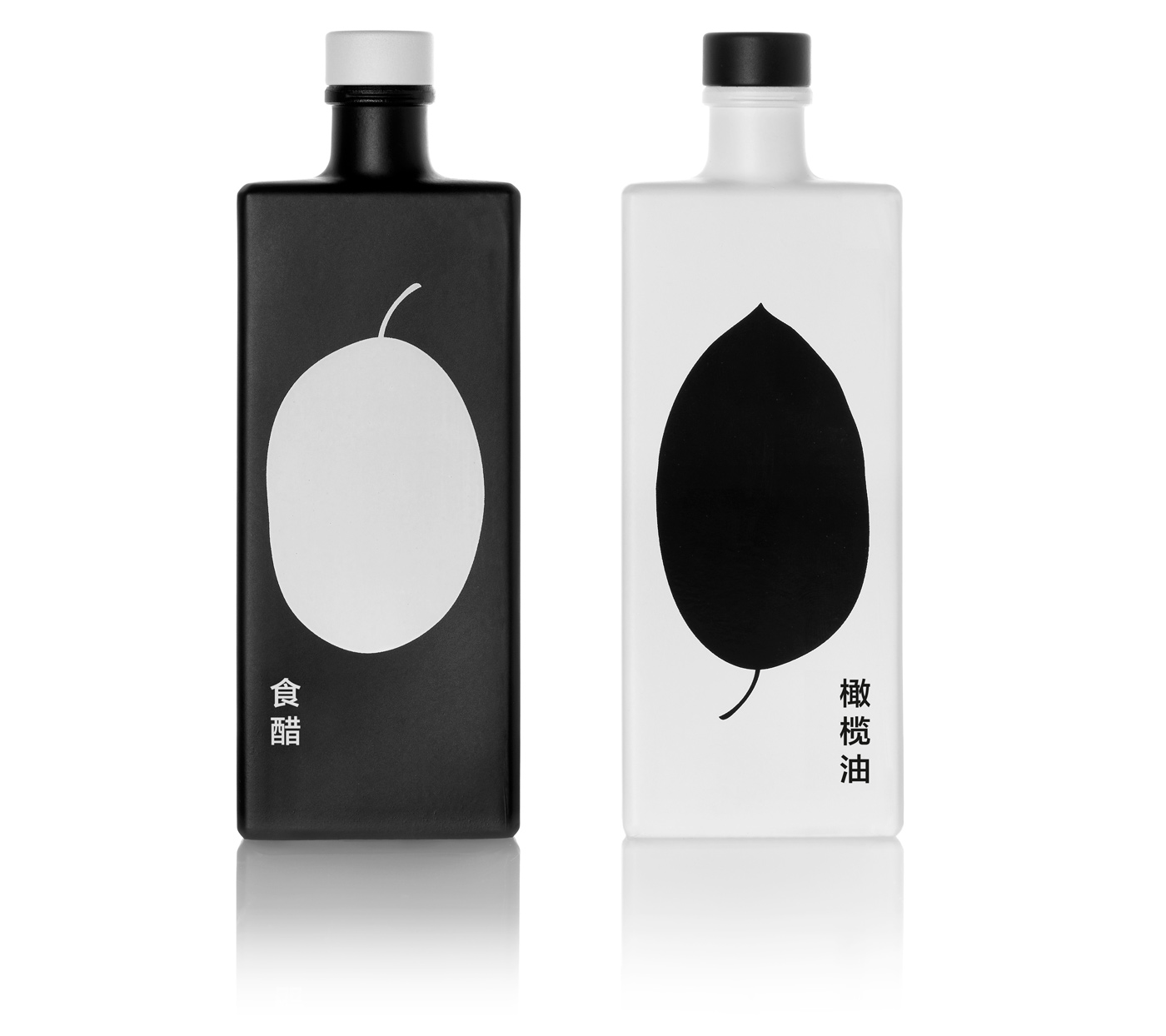
6. Black and white packaging
—

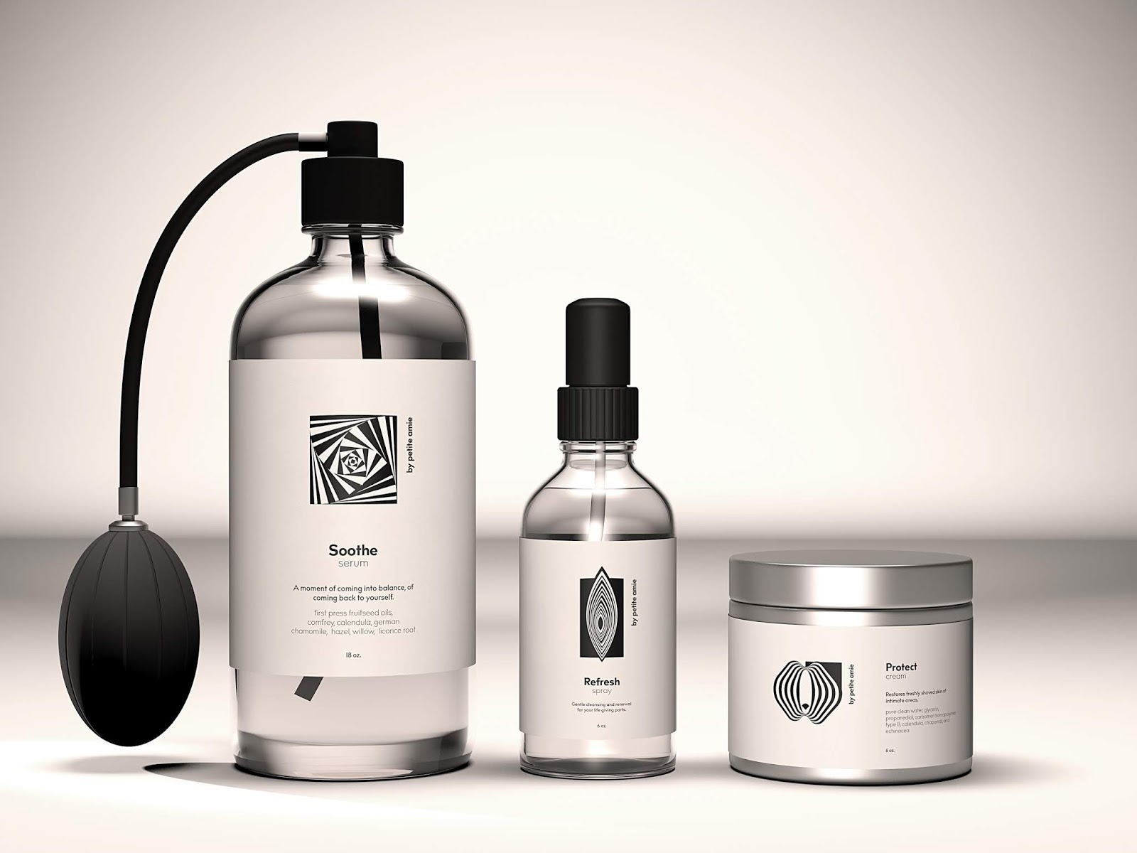
Stripping down your palette to just two elements might seem restrictive at first but as far as black and white are concerned, it always turns out to be a powerful and incredibly versatile dialogue. The dynamic that they offer in a design is impossible for the observer to ignore. It is an incredibly effective way to create separation between the elements of the design and to establish the relationship—or lack thereof—between them.
A great example of using one of the most emotive visuals in nature is the work by mousegraphics for GAEA above. It is clean, simple and it balances itself out in a satisfying way. On the other hand the combination of black and white can create complexity while maintaining the same minimalistic traits, as illustrated by Ula Krasny in the project for petit amie below.

It may represent a challenge at first, but with the right intent and application, a black and white only design can really pack a punch. The final result might surprise you.
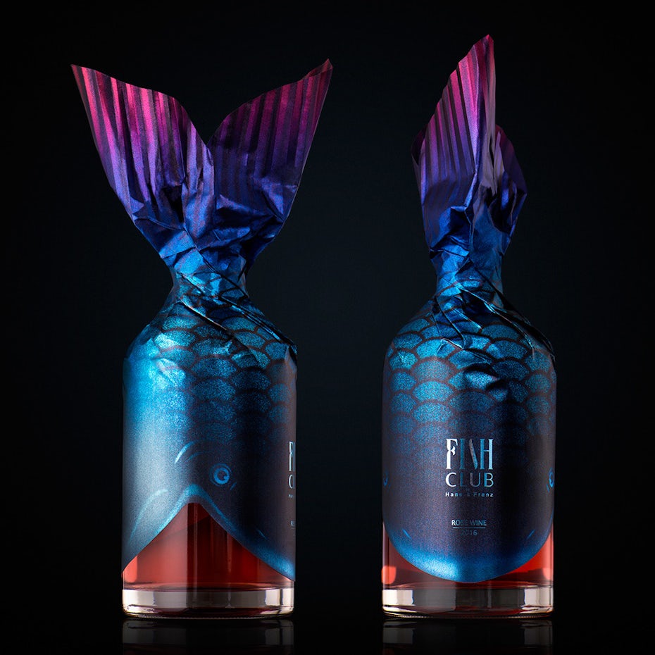
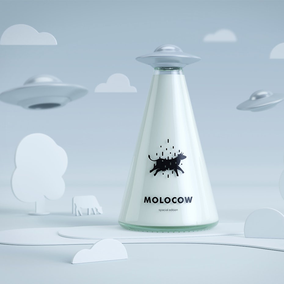
7. Atypical packaging design
—
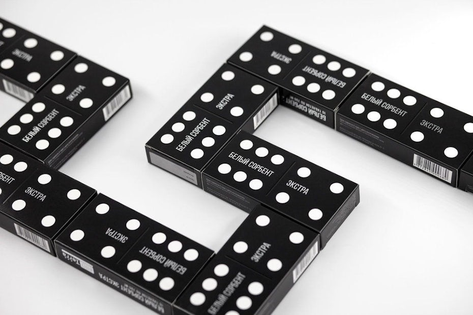
Given the choice between two products with the same price, we will almost always choose the one with the more attractive packaging. So why not stand out by surprising your customer with a design choice that is uncommon and can communicate in an unconventional and fun way?
For example, you might not expect to find white activated charcoal in a domino piece-shaped box. But Lesha Limonov found a great way to translate the domino principle to human health and convey it in an unusual yet premium package.
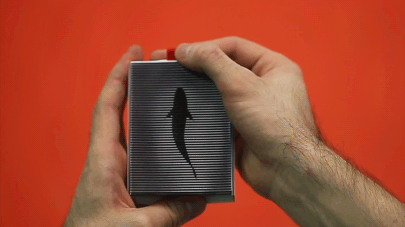
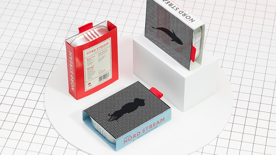
Another pleasantly surprising and unconventional work is the moving packaging for Nord Stream Seafood by Loco Studio. Based on interference patterns (moiré pattern), the picture which is on top of the package starts moving when opening it, both impressing and involving the customer.
In 2019, expect to see lots of unusual and original approaches to packaging design, the most memorable being the ones that can be used for purposes other than packaging itself.
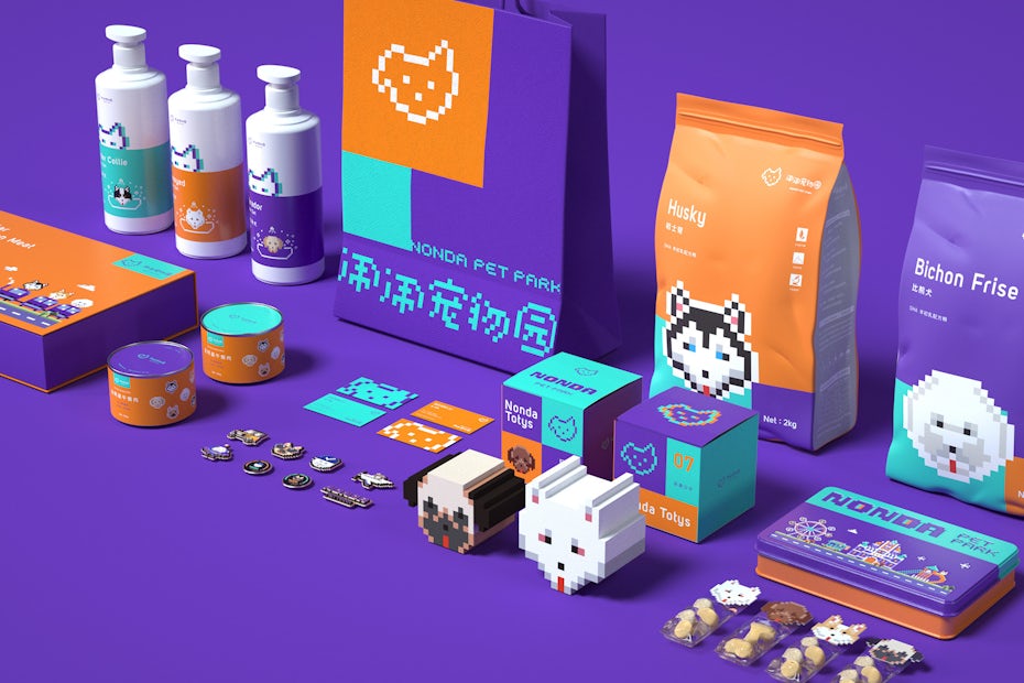
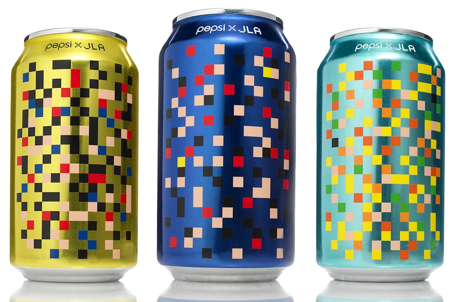
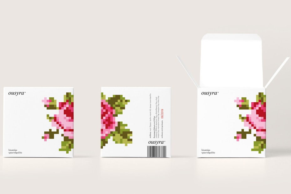
8. 8-bit packaging design
—
Retro is back in! And one of the most retro thing of all is the classic pixelated game console look. It’s a trend that remains strong, far past its expiration date. The art form of making digital art with raster graphics software, where images are edited on the pixel level, lives on. It has a unique place in our collective cultural consciousness both because video games are popular as ever and because it is simultaneously out of date and timeless.
The constraints of 8-bit design are at the same time its strengths. The stripped down images full of pure color fields, hard edges and straight lines are both commanding and accessible to customers. It’s a simple way to communicate an idea that might be complicated to illustrate through other art forms—or to add an ironic nod to the past to a product.
Although it is the product of a bygone era, 8-bit design is rooted so deep in our memory that it is sure to extend its lifespan for years to come.
9. Plastic free packaging
—
Going plastic free is a growing trend that should be embraced by each and everyone. Paper and cardboard materials are the main contributors to packaging waste, followed by plastic and glass, a significant percentage coming from food packaging.
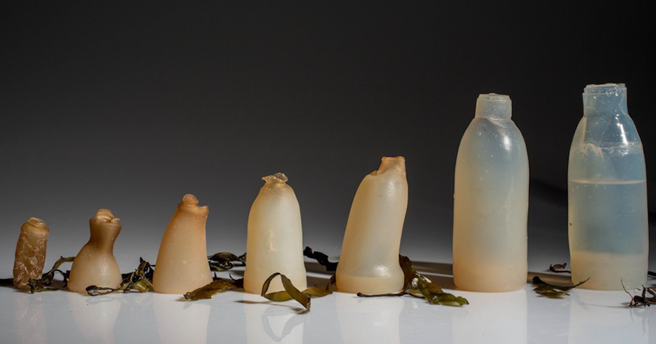
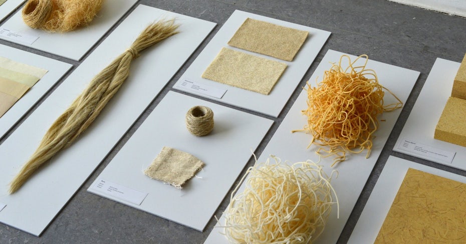
As a response, every year we see more and more advances being made in the science behind the materials that are being used for packaging. From algae based plastics to see-through hemp wrap and mushroom styrofoam, we are seeing real alternatives to plastic being created that should lead to a more efficient and sustainable future.
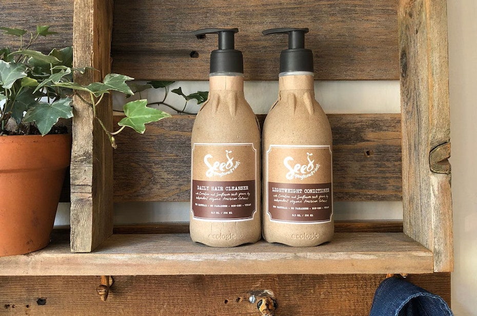
A good example for this is the collaboration between L’Oreal and Ecologic Brands with their product Seed Phytonutrients: a recycled, recyclable, compostable, paper-based pump bottle made for shower use.
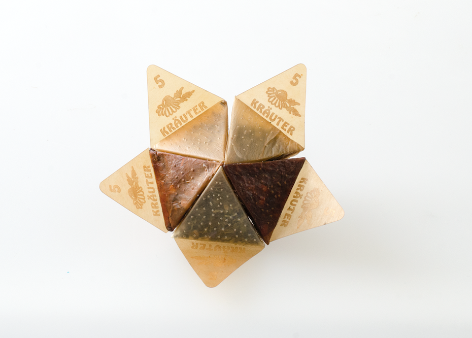
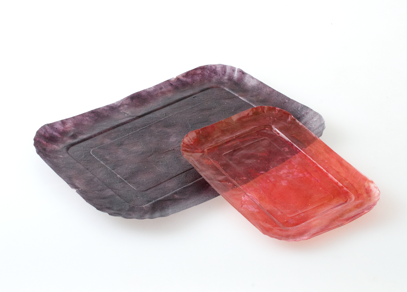
And of course there’s microbial cellulose packaging ingeniously showcased in the From Peel to Peel project by Emma Sicher, an initiative with huge potential.
In 2018 we also saw the first plastic free aisle pop up in a shop in the Netherlands, a great testing ground for compostable biomaterials. The choice between plastic and plastic-free products starts to become a real option for consumers—hopefully on an increasingly large scale in 2019.
Are you ready for 2019’s creative packaging trends?
—
2019 is going to be an exciting year for packaging designers. From amazing color combinations to no color at all, from minimalism to vintage styles, and from ingenious packaging solutions to plastic free packaging—it’s going to be a year of contrasts, and everything is possible. Designers are taking past trends to their extremes and are finding new and clever ways to make products practically jump off the shelves. We can’t wait to see what 2019 has in store.
