Second Design Pacifica Menu

0
Creados en 99designs de Vista
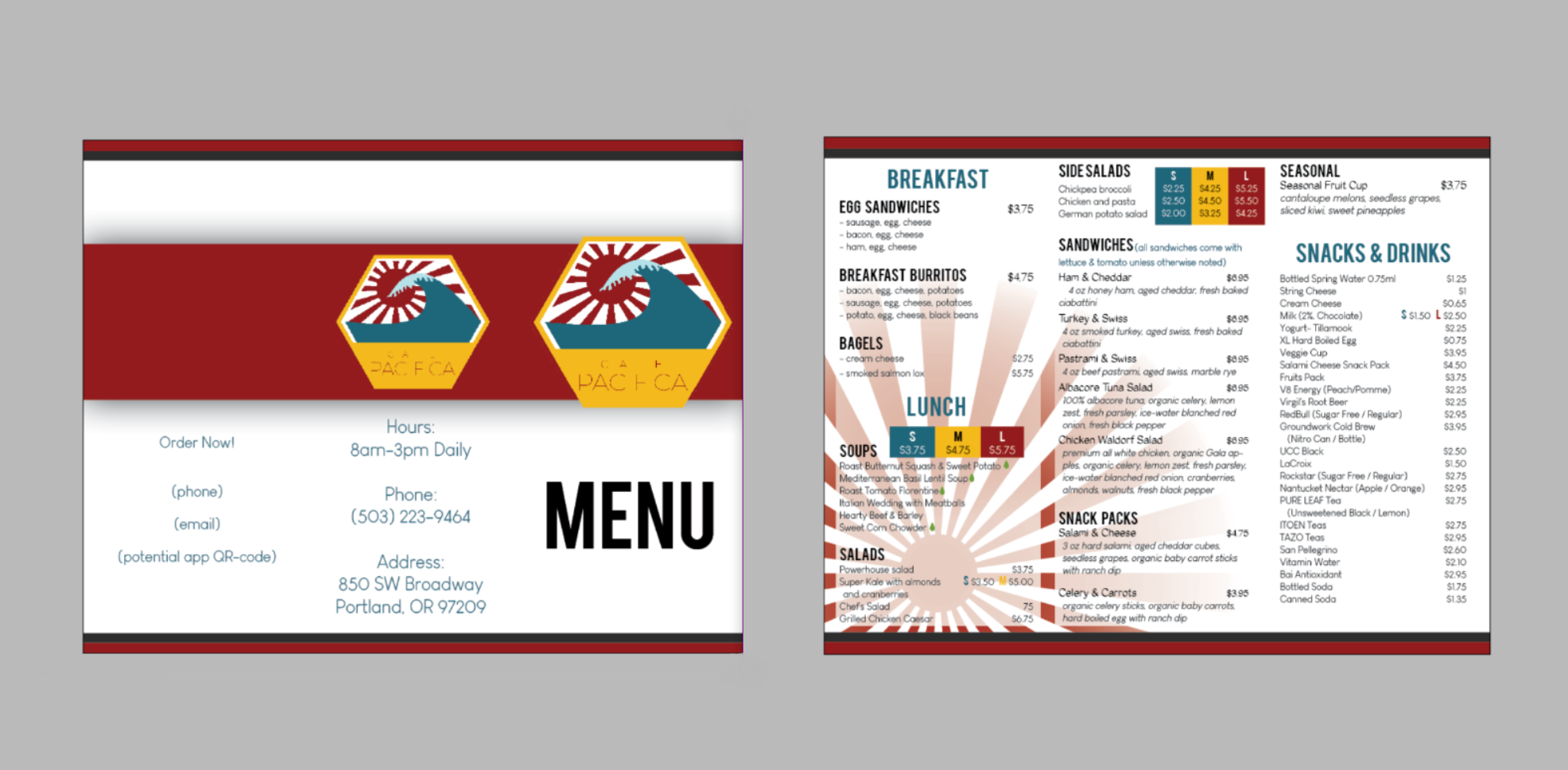
With this design i paid more attention to the red rising sun from the logo. Less simple than the first one, and more reds than the other colors. I chose red because that color makes people hungry (which is also why I colored the ''large meal" frames with red).