Web Design (Dance Academy)

0
Creados en 99designs de Vista
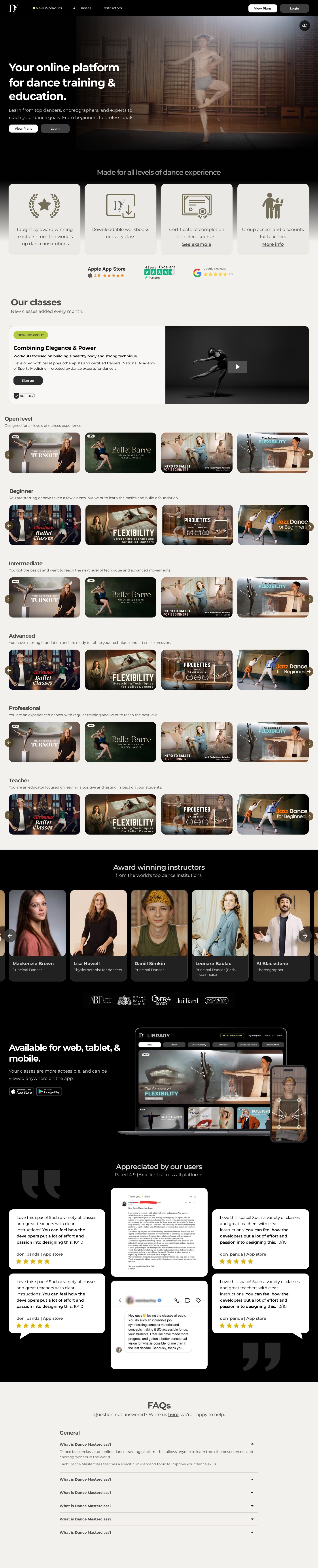
I started by analysing the existing website, and improvement areas both visually and from a usability perspective. With this, I have the following design:
1. The header section was made more visually stunning.
2. Highlights: The highlights of the platform were scattered in the existing site. I dedicated an area for it on top, where new users can see all the platform has to offer in one go.
3. Classes: The most important part! The existing design was difficult to scan. Since the USP was that it was for all levels, I introduced a filtered view that could be scanned easily. New workouts were highlighted on top.