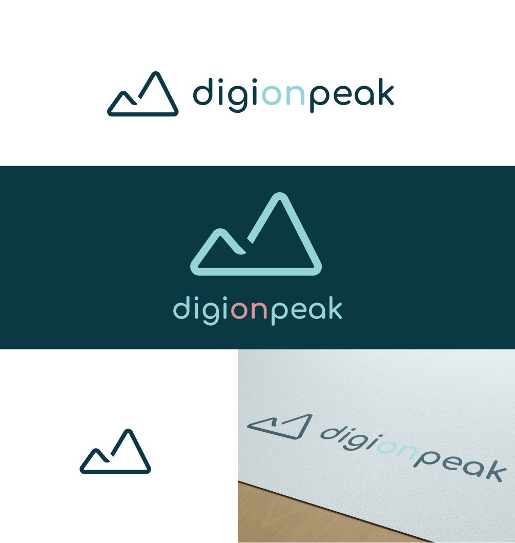

Simple and modern, with a contrast between organic and geometric shapes. Graphic design is all about shapes, we can't design without geometry at all.
No straight lines, everything is rounded, including the font which gives an idea of technology.
The mountain was the main concept for all two options, it definitely represents better the idea of "peak", something at the top.
Blue has to do with intelligence, technology, and creativity. The salmon is totally optional but I believe it gives the whole brand some more contrast, strength, and emotion.
This logo can fit everywhere, has a lot of versatility, multiple applications. You can choose to use the icon (the mountain), the wordmark (the font) and both together. It's also possible to create emblems, to include logos inside of shapes, to use the mountain to create patterns, to use the icon as an image signature, to make stamps...