
Creados en 99designs de Vista
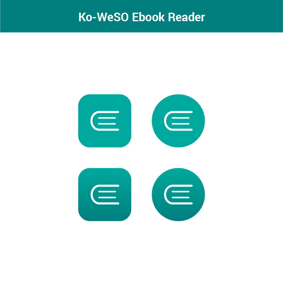
The client had a specific design in mind - a simple book icon viewed from the top/bottom. They provided an example of a design, and specified colours - an orange background with a white icon. They wanted a more mature, minimalistic, original icon.
I provided them with an icon designed as close to the explanation on the brief as possible, keeping it original, and also introduced a much different icon and a different colour. In the end, they decided on the first icon design, but with the more mature colour that I suggested.
The icon is designed to look good when scaled down to 16 px, and up to 1024 px so that it can be used on any operating system and device as needed.