
Creados en 99designs de Vista
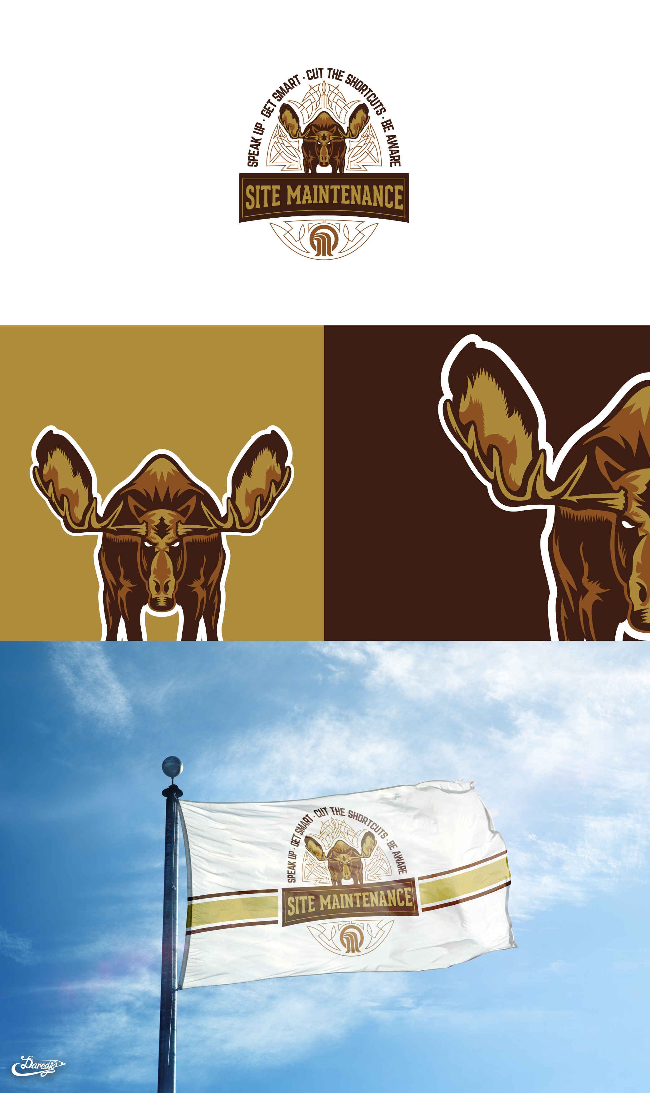
The client approached me with the request for the logo to look like the bold and mean tough image of a moose.
I have added the pinstriping surroundings for the cool factor and for the nice rounded effect of the logo.
The moose itself is really mean and tough looking with the execution of it.
They are the site maintenance sector and the main company logo is incorporated into the lower part of an emblem below the company name.