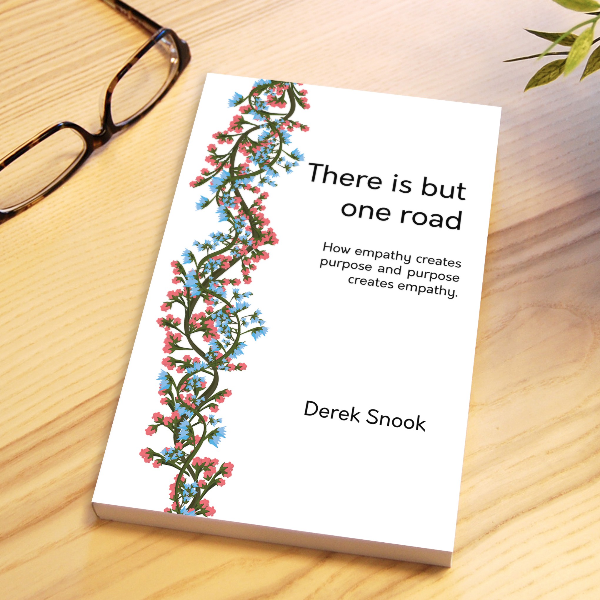

I wanted to recreate the bond that is created between two interweaving paths. Separate stories, lives, paths, represented by each vine; similar in many ways (shape and form of the stem) yet different (flower color and shapes). These paths may start from different places, sometimes moving parallel to each other, sometimes crossing each other, but they’re always connected, going towards the same place, one holding the other, helping the other.
The title complements that idea, and the fact that we don’t see the beginning nor the end of either element, hints at that ever-present concept. The white space is used in order to draw focus where is intended: firstly, to the colored elements (the most important part of the story), then to the title, the tagline, and the author. The typography follows the same principle, being modern yet subtle enough not to compete with the aforementioned hierarchy.