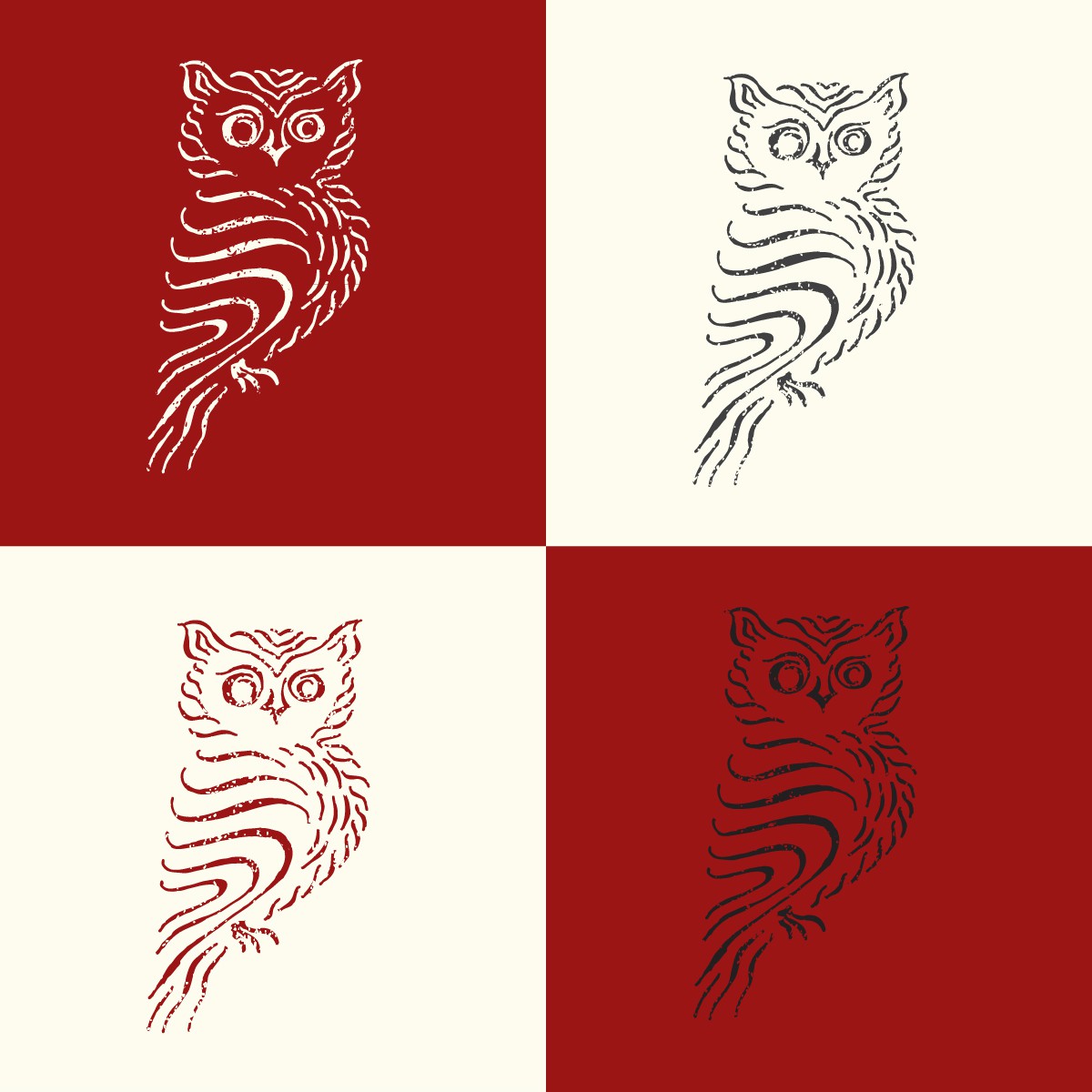
Hand drawn logo for a vineyard

0
Creados en 99designs de Vista
Preliminary hand sketch of an owl logo for a vineyard. I opted for gestural lines in lieu of blocks of color to create the owl form. I think this creates a more expressive result that is not only more eye-catching, but also easier to connect to a brand narrative; it starts to tell a story a bit more than a standard vector owl icon.