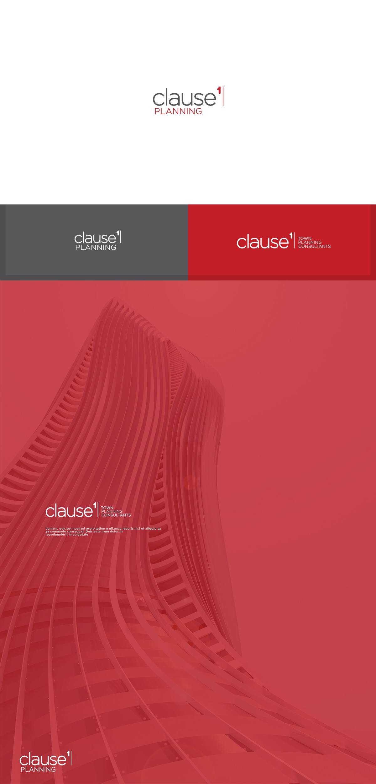
Clause1 Planning – Minimalist Identity for Urban Visionaries

30
Creados en 99designs de Vista
This design balances precision and modernism, reflecting the clarity and authority of a professional town planning consultancy.
The clean, sans-serif typography paired with the numeral “1” emphasizes simplicity, hierarchy, and structure—key elements in urban planning.
Presented across multiple colorways and contexts, the branding adapts seamlessly to both digital and print, establishing a confident, bold presence.