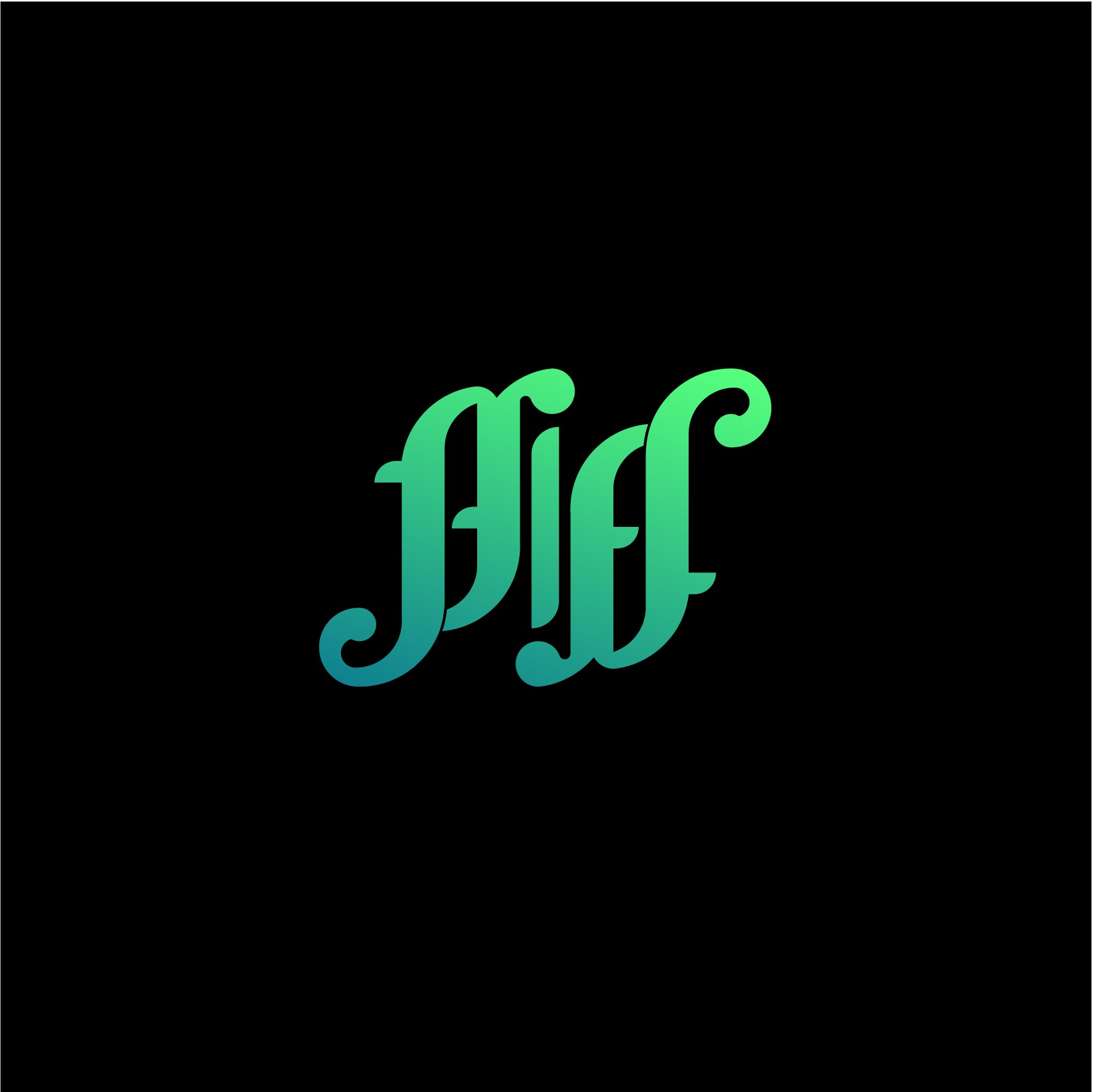

Taking the main elements of the traits of creeping plants, this logo is created in an ambigram style, when reversed it will read piff too. I think this is very iconic. softelling, and not too extreme, the style of dare for each shape will also feel very organic, the feel of cannabis will be felt.
the philosophy of this logo is more to the benefits of cannabis which is very broad, global, and universal, cannabis can be processed into anything and can be useful especially for recreation. each curve in the letters p and f is a simplification of the illustration a "bong" represents that in piff everything is available, from cannabis, to the accessories. complete.
if seen from a distance, this logo will form a pattern of "infinity" is about unlimited imagination when you buy a product on piff,
dynamic.
I would be very grateful if you want to provide input / criticism / suggestions on the logo that I designed, so when you need a revision, I can do it better. thank you :)