Prairie Craft Poster Design

0
Creados en 99designs de Vista
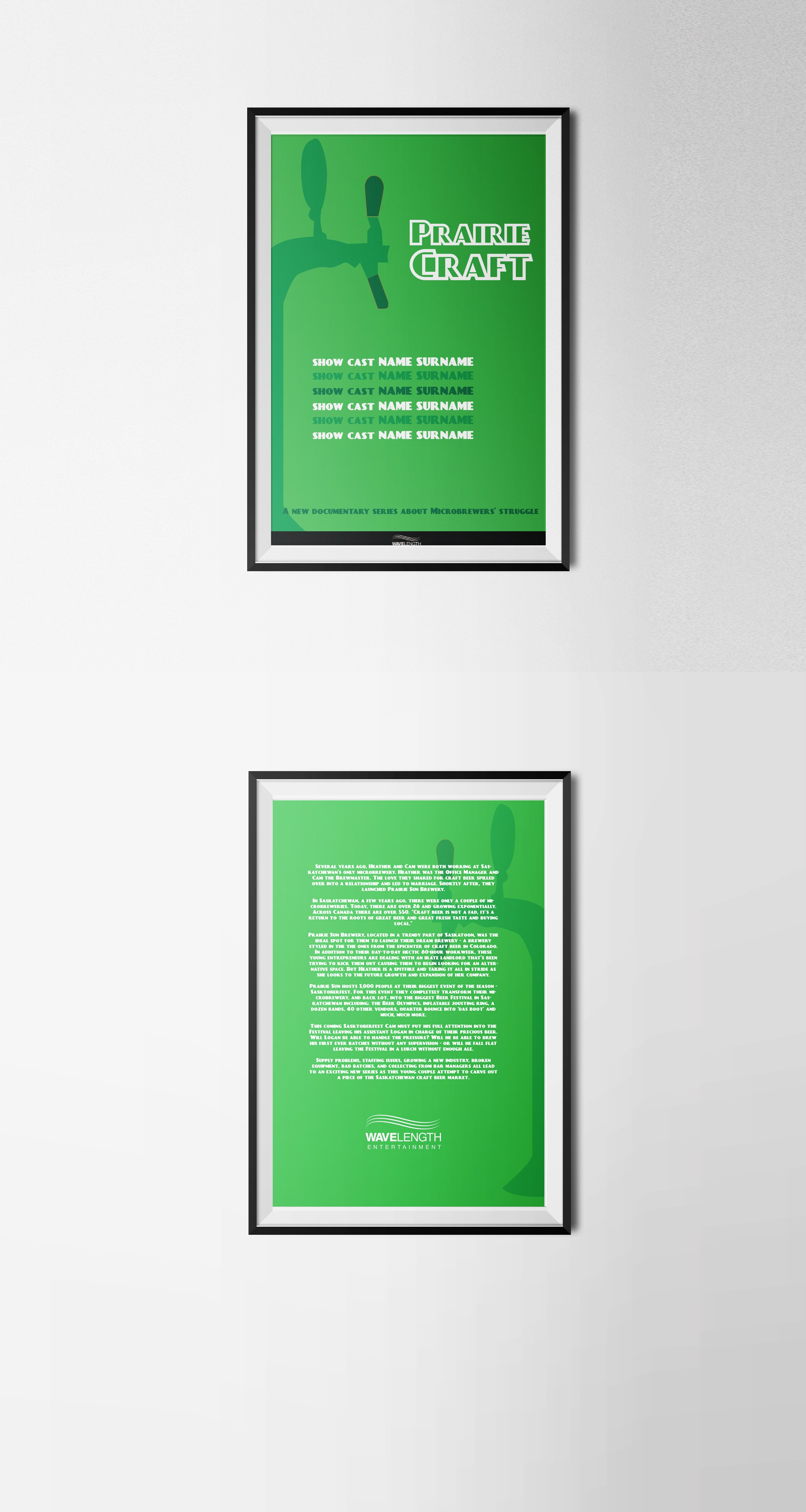
By being a design for a sitcom I thought that a minimal vectorial approach would work best.
The positioning of the producer's logo both on the front and the backside is guaranteed to emphasize it.