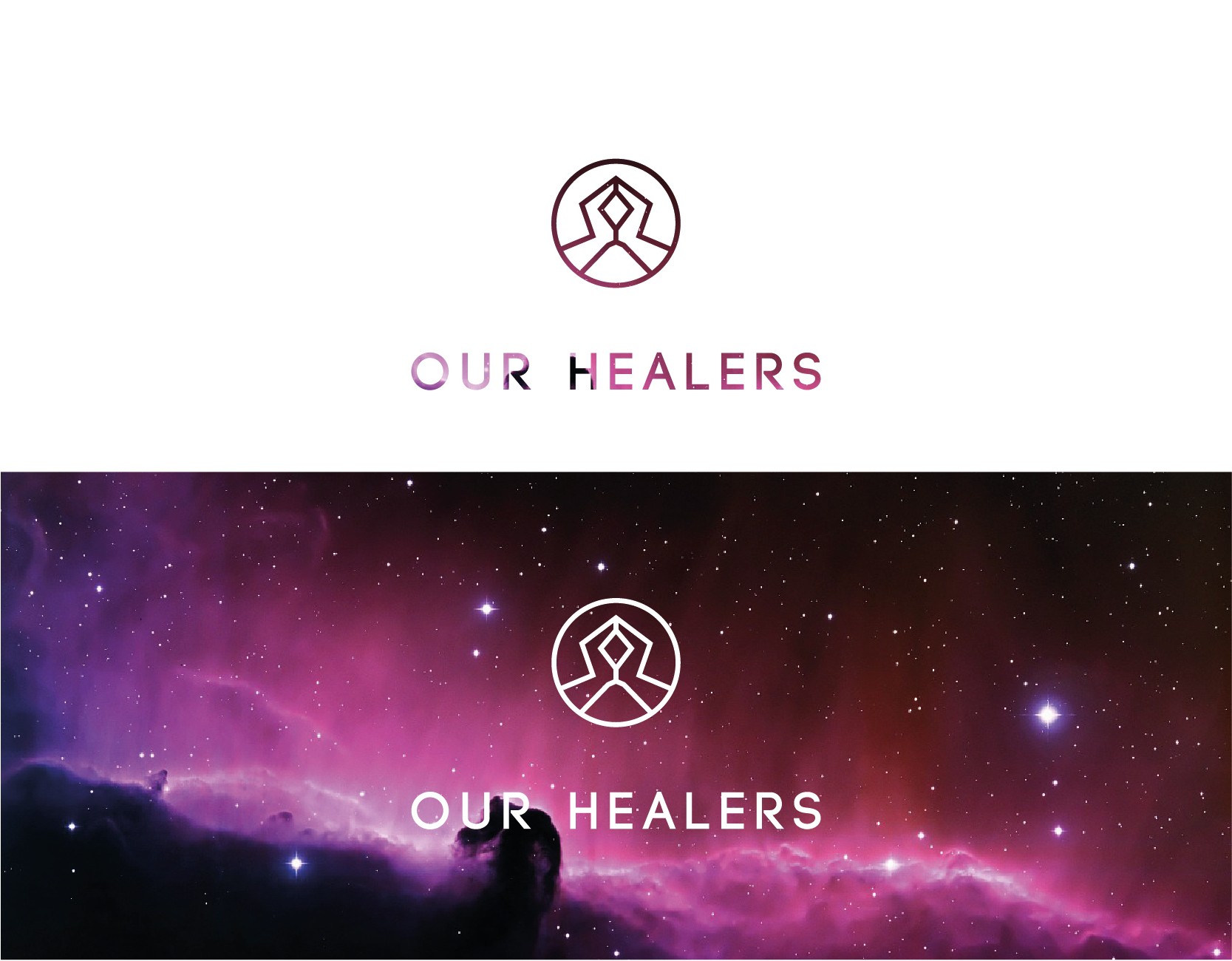

This logo was made for a start up whose project was to create a social website where healers and clients can meet and establish communication.
The client wanted a specific modern style, where same thickness lines are used to create simple and minimalist logos. I used the rule of thumb, simple is better and designed the outline of two hands against each other, frequently used during meditation. The reason the hands are not flat against each other was to avoid a religious connotation. Originaly, this logo is meant to be solid black, but my suggestion was for the client to purchase a picture of the cosmos and use it as a texture, appealing to the brands spiritual nature.
I do not own the picture I used, but it is labeled for reuse. I am merely using it to showcase my logo. The logo is entirely my creation.