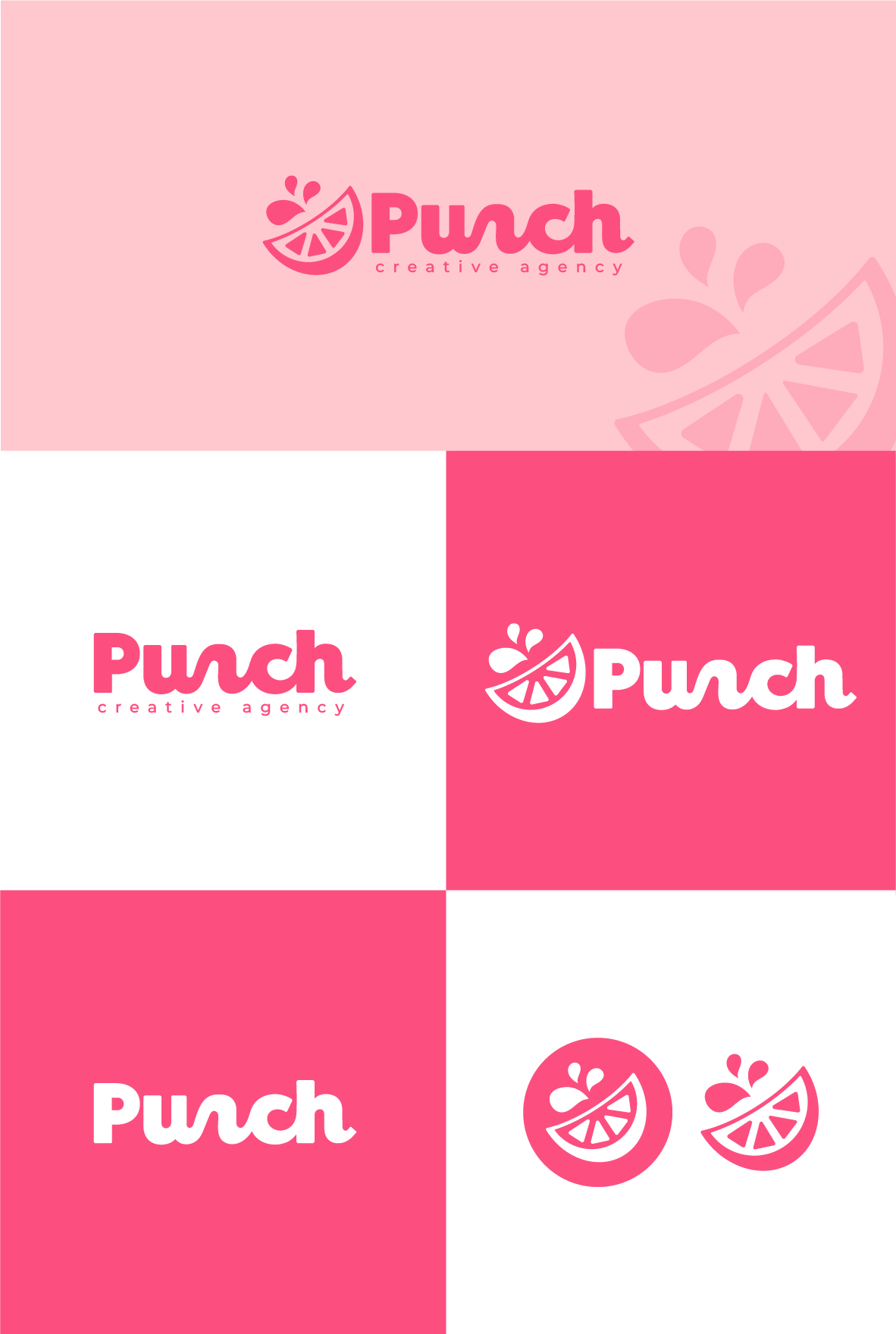
Logo design concept for a creative agency
8
Creados en 99designs de Vista
The contest holder was specifically looking for a logo design that could be easily deconstructed to give a range of layout options.
For this design, I used some custom typography to add lots of visual interest to the design and also create something truly unique. The addition of the fruit wedge was to denote the word punch as a fruity beverage instead of an act of violence.
