Información necesaria
Nombre de la organización
RECURVE / FLEXmarket
Descripción de la organización y el público al que apunta
Recruve uses smart meter data to track energy efficiency savings so that utilities can procure efficiency as a resource. We are b-to-b, we work with utilities and finance companies, contractors and others to provide data analytics and the ability to trade efficiency as a form of capacity.This particular project is focused on our Demand FLEXmarket (http://www.demandflexmarket.com) which enables companies (aka aggregators) which enables companies that effect energy use from measures such as insulation, smart thermostats, HVAC, lighting, etc, to get paid for the benefits they provide to the energy grid.
Industria
Medio ambiente
Detalles del contenido
Tipo de Infografía
- Online (Website, newsletter, email, etc.)
La historia que contar en la infografía
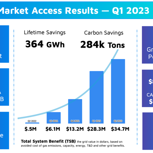
This info graphic are key results from the Market Access Program, that Recurve ran for PG&E. This program was a result of governor Newsom's summer reliability emergency to avoid blackouts.
For more general context on what this program was, see this page: https://www.demandflexmarket.com/vi…lants.html
We want to share these outcomes and illustrate how quickly and effectively the program has scaled... And how much better it is performing than traditional energy efficiency programs. It is a lot of statistics, that I have tried to group together. I want to highlight the key parts, like the fact that in essentially 1 year this program increased the grid value of energy efficiency in commercial buildings in California by 41%, and for every dollar spent there was 2x the benefits to the grid, compared to the rest of the portfolio.
Datos a incluir en la infografía
We will upload some examples of the actual data as an image, which is my personal best infographic... (see uploads and links to gdocs). Do not feel constrained by my handy work!
You can see the data we have here: https://docs.google.com/presentatio…sp=sharing
Here is the data behind the chart: https://docs.google.com/spreadsheet…sp=sharing.
I want to include this info, but I also want to make it simple... highlight the most important points, and make it feel less cluttered. Not all the data is equally important.
Elementos para incluir en la infografía
I would like to use the FLEXmarket logo and imagery, and should generally fit with the https://www.demandflexmarket.com website. Though I do not want to copy the header image... which is actually on the chopping block. Clean, modern, simple...
Designers can also check out the http://www.recurve.com website for design inspiration. This graphic is about FLEXmarket, but it's a sub-brand of Recurve overall. See style guide for Recurve: https://docs.google.com/presentatio…sp=sharing
I am interested in imagery that evokes a "Meter."
The top-line brand is FLEXmarket and Market Access. Perhaps you can use some of the images in the FLEXmarket logo, or at least that line and dot style.
This graphic should scale to fit on part of a page or in an article, and also for use on our website. It may be that we drop text on what TSB is for smaller use cases.
Referencias
Imágenes de stock
El cliente no está seguro si quiere usar imágenes de stock en este concurso.
Las imágenes de stock son fotos con licencia y archivos vectoriales. Declare las imágenes de stock cuando presente sus diseños para que los clientes pueden pagar las licencias.


Otras notas
Key ideas is that this is related to upgrades to commercial buildings from things like HVAC, lighting, controls (smart thermostats, etc), windows, batteries, etc.
I would like to include "POWERED BY: Recurve (logo)" and I would like to credit the FLEXmeter someplace... that is the name of the software / methods that did the calculations... this could be bottom corner of the graph in the middle perhaps?
Ideally the graphics will be modern and clean, and reflect the brand colors.
I expect to use this format and update the data and potential charts with new information overtime.
This graphic should work on light or dark backgrounds (or have a different versions).
There are a lot of "data" and figures we are sharing, some of them are related, but want to make the key takeaways clear. Like, the Market Access Program added 41% to the State's commercial energy efficiency grid benefit, in only 7 months, and delivered 2x the grid value for every dollar spent.
These are the key stats I generally use to explain how well it worked.
Archivos finales del concurso
1 x Diseño digital
Archivos finales
Si usa tipos de letra que requieren licencia, confirme que el cliente esté de acuerdo con su uso. Por motivos de licencias, es mejor proporcionarle a su cliente información sobre cómo adquirir el tipo de letra en lugar de proporcionarle los propios archivos.
This is the main logo for FLEXmarket... this Graphic is for Market Access, which is a FLEXmarket (a bit confusing, but our branded part is FLEXmarket above.